Wednesday, 17 December 2008
Fabrics.
Following on from my Morocco Project, i had to work with them further to create fabrics which could be shown at Indigo, the trade fair in Paris. I prefer to work with paper, so i found this quite a tricky project and it wasn't my best. Colour was still the main aspect to this project and i felt this was the most important. I wasn't sure how i was going to come up with my final designs, and as i think to make things, i ended up making fairy lights. This is because lights were such a key aspect out there and there was plenty of market stalls that sold lanterns and lots of decorated glass. I began by making my fairly lights, i used cutouts as the main focus of them and created little cubes which had been spray painted and then areas were cutaway. i found that these created some really unusual shadows, so i took pictures of them on different surfaces. I then transferred these images to Photoshop and worked with building up the shadows in different layers. This blue piece is an example of how one of them looked. I then used this process several times creating different pieces in different colour pathways. These were then digitally printed onto silk. I was happier at the beginning of the project crafting and making things, but i found choosing the fabric rather tricky, especially something which was going to be exhibited.
Wednesday, 29 October 2008
Why are you studying Printed Textile Design?
Thursday, 23 October 2008
Inspired by Morocco
Following my trip to Morocco, i began to work with the idea of the highly detailed amount of pattern that you can find over there. Colour was another important aspect of my work and i think it always is.
These are some of the samples which i created. I especially like the origami papers. I had screen printed the designs and then folded the paper up into two different types of stars. I thought that stars would be appropriate as it is a Muslim city. I wanted to make a shape which fitted with the theme of Morocco.
This black image was a cut out which was done on the laser cutter and mounted onto white paper. I also did this is reverse and i think that they look very effective next to each other.
I was happy with how this project turned out, yet i think there could have been a lot more scope for me to try new things. Even though i took a lot of photos out there, i think i was a bit limited to ones which i could actually use within my work.
Monday, 15 September 2008
Morocco
Over the summer holidaysi visited Morocco with a friend. Firstly to get a bit of sun and secondly to experience a completely new culture. I have never been anywhere like Morocco and i found it the most exciting place. It was full of colour and pattern. Everything was highly decorated, from the lobby entrance of the hotel to the little glasses for minty tea. The colours were so rich and vibrant, from earthy tones of reds and oranges to the cobalt blue which comes from the Atlas mountains. The souks were in a world of their own, alleyways of stalls. We went to the tannerys and witnessed the locals making shoes from camel leather, as well as going to the dying souk, where we got a turban. 'Fish and chips' was the local phrase for us, we did look like tourists with our camera's at hand at every oppertunity! The textiles pieces varied in size, there were small wall hangings to massive carpets which would cover a whole room. All in all it was a fantastic holiday with so much to do and see and plenty of photo oppertunities. I would recommend it to anyone.
Friday, 2 May 2008
My photos
Monday, 28 April 2008
Adrian Brannan
Adrian Brannan is a photographer who looks at different ways to present his photos. The place that is being photographed is monitored over a long period of time, up to 2years.
The intention to is to show the vibrancy and life of a city. All of the photos are arranged and layered up by hand. The images are fairly large about 90cm x 60cm.
I like that you can still tell what the pictures are of but as they are jumpled it gives an extra texture to the piece. There is also the randomness of the photos as they are not layered up straight. I would like to do something like this but i would have to choose an area very carefully.
Monday, 14 April 2008
Lomography Exhibition
Sunday, 24 February 2008
Flocking, foling and flittering
Foiling. Again this involves using screen printing to apply the adhesive to the paper, then followed by the heat press. It can also be used with photocopies by placing the foil on top of the photocopy and put in the heat press, it then sticks to the black outlines. The reversed can be created by applying bondaweb and then ironing the foil on to the top.
Flittering is like glitter but it is much finer so can be pulled through a loose weave screen, but an easier way is to screen print with the the binder and when it is still wet add the glitter to it. This can then be shaken off, if it is applied thickly it should stick. By then putting it in the heat press for about 1minute it should keep the glitter in place.
Sunday, 17 February 2008
Kitty craft fabrics
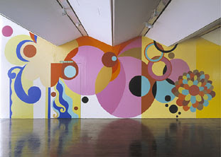
Beatriz Milhaze
Wallpaper archives
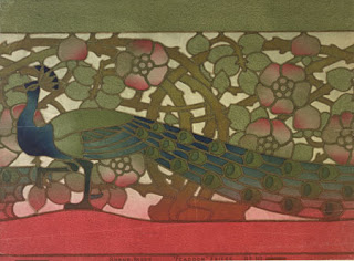
The archives contains wallpapers and wall coverings from as early as the 17th century up until the present day. It began with simple patterns which were hand crafted on small sheets of paper, to 18th century luxurious embossed hangings, to well known designers like William Morris, Voysey and Crane of the late 19th century.
I found this section really interesting as you can see how technology and styles have evolved. Wallpaper designs began being hand printed and were quite simple, but as technology advanced so did the detail within the patterns and the use of machines to print the designs. Also the advances in paper has changed, now there is an 'endless' roll of paper, whereas originally the paper was a limited size.
Whitworth Gallery, Manchester
We recently had a trip to the Whitworth gallery to see its current exhibition of 1920s and 1930s wallpaper designs. We also looked at the wallpaper archives, looking at wallpaper from the early 1900s.
Flights of Fancy
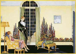
During the 20th century there was a move away from highly patterned walls which obviously affected the manufacturers. So paper decorations were produced on to textured papers. In the 1920s and 1930s this was widely available and varied largely in price. The exhibition consists of papers which were inspired by the outside and brought inside. There were large potted plants and you could also get smaller shrubs to act as a border. Alongside the samples were pictures of how it would look in the house. (as shown above). As you can see there is very little furniture as it would have blocked the wallpaper which also fitted with the modernist style.
Howard Hodgkin
Howard Hodgkin is a British painter and printmaker and his style is very much considered as abstract. His paintings often evoke memories of his encounters with friends or a place he has visited. His pieces are much smaller compared to Rothko but they often take a few years to be completed as more layers are added.
Again colour was my inspiration for looking at Hodgkin, it is more random to Rothko and there is a looser style which i think is more fittting with my project of lights. I like how the painting continues onto the frame so there isnt a border but an extension to the piece.
Mark Rothko
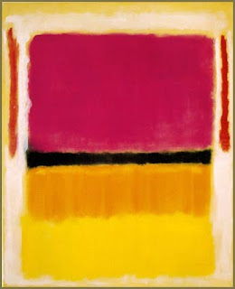
Rothko (1903-1970) was a painter and printmaker and is classified as an abstract expressionist. He is known for his large scale paintings which are rich in colour.
Making books
After getting the 'objet trouvet' brief i knew that i wanted to do something with photography. I have a camera which has a long shutter speed so i wanted to look at lights and colour because i wanted something bold. I also liked the idea of how a book should look, i didnt want to do anything too plain so i worked with the idea of having separate pages and then putting them together in a box which looked like a book. After i had done this i still had several photos left over so i went back to one of my earlier ideas and put the leftovers together in a consatine book. I mounted them on black paper so that it would stand out more. I finished it off with a hard cover and something which was relatively plain in comparison to the book itself.
Overall i was happy with this project and looked at sveral different artists to reinforce my ideas. These are listed below.